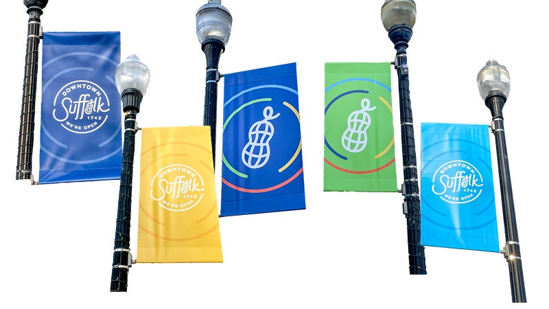
Vibrant city banners marks start of new Downtown signage plan
Published 7:51 pm Friday, January 13, 2023
|
Getting your Trinity Audio player ready...
|
Downtown Suffolk is starting to see new, colorful banners flourishing various lamp posts within the area.
Designed with the city’s famous peanut in place of the “o” in Suffolk, the new banners provide vibrancy for locals and tourists as well putting the city’s history at its core. The banners are part of a new plan for the downtown area.
“As part of the recently adopted Downtown Master Plan, one of the objectives was to create a coordinated signage system for downtown,” explained Suffolk Business Development Manager Deanna Holt.
“With the banners being the first stage of this new system, we wanted to showcase the downtown logo, which features a vibrant color palette and a peanut that replaces the “o” in Suffolk, representing the importance of Suffolk’s history. The same theme will be repeated on a series of new gateway and traffic signs that’s planned to be rolled out in the coming months.”
When talking about the process of creating the design of the downtown logo, Holt emphasized the importance of the city’s openness to positivity and diversity.
“When the downtown logo was first introduced a few years ago, the main design element was to relay to everyone that ‘we are open’ – open for business, open to cultures, open to visitors, open to diverse ideas, people and energy,” Holt said.
She said they believe this is an important element since they rolled out the logo right as the world slowly started to open back up after the COVID-19 pandemic.
“We take pride in our downtown and by having its own unique logo, businesses are able to use the logo alongside any of their branding or marketing materials,” she said.
Holt shared her excitement for the new project and the start of a new strategy for wayfinding.
“We are passionate about downtown and want to show that it is a destination for shoppers, diners and tourists with all that it has to offer,” she said.


